Mixed Media Research
- Dave Macey

- Mar 23, 2016
- 2 min read
I’ve started to consider how I am going to make the campaign posters, on their actual design and layout. I’ve tried various ideas but none have really seemed to work, but I do feel that I have made some headway.
I’ve been looking at various campaign posters from the political parties from the last election and the ones that have caught my attention are the ones that were created by UKIP. They have a very simple design based on three rectangles and use bright colours to catch the attention. They are also very simple, relying on one image, text to anchor the definition of the image and then the same repeated slogan on the right hand side with the UKIP logo. Overall, these are very simple, straightforward and easiest to understand. They transmit their message in such a direct and forceful way that there can be no mistake in their interpretation. They fulfil the elements of propaganda that play on people’s fears and promotes a cohesive narrative, as they are always about the same issue – immigration. But very few of them are photomontages, I’ve only been able to locate one and that is of an escalator going up the white cliffs of Dover, the others are just clever uses of text and imagery. When compared with the work by Peter Kennard or John Heartfield, they lack the incisive wit but just rely on unsubtle directness to transmit their message.
But with the design of the posters, I’ve decided to copy the layout of the UKIP posters, but to change the colours to different shades of blue with the conservative logo in the bottom rectangle. I did try a bright and strong blue but it was too overpowering. I’ve also been thinking about the logos and what to use. From the library I got a copy of Mein Kampf, which I plan to use for quotes for the essay, but I also think I could see if there are any quotes I could possibly use it for the posters. I thought that this could work quite well as the book is extremely anti sematic and and it could be possible to use it for anti immigration, plus it would link the posters to the racist sentiments of the Nazi regime.
I’ve also had a brief look into graphic design and what basic principles I could use. On the website http://www.makeuseof.com/tag/5-basic-principles-graphic-design-take-granted-everyday/ they suggest 5 elements, that of proximity, alignment, repetition, contrast and white space. All of these seem like good ideas as they can help the poster look cohesive and professional instead of cheap and amateurish, but I will need to practice these principles though it does give some structure to the designs of the posters.
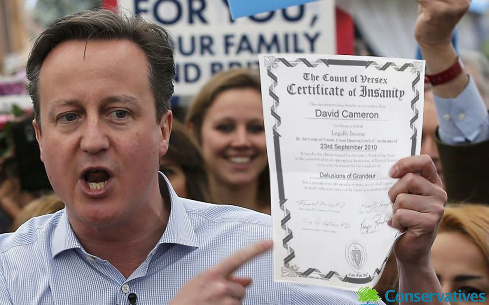
Below is a gallery of my attempts of making a campaign poster. None of them are really any good as this is still all work in progress, but it does show some progress.


Comments