Mixed Media Research
- Dave Macey

- Dec 4, 2015
- 3 min read

Sam Tutorial
I showed some of the prototype to my lecturer who gave me the following feedback:
The images and the text don't really match and are becoming too obscure. This can be remedied by deciding on the text first and then the photograph, to use the text as a title for the image and then decide what to photograph to juxtapose with that text.
So, for example, on a page that has "we will protect" underlined I can use a photograph of an open door or something that is lacking protection. It seems that the important element is the juxtaposition, for there to be a conflict between the text and the images and it is the conflict that sets the tone for the viewer to experience.
I also need to be more direct as I seem to be getting a bit obscure. I didn't want the artwork to be too obvious and so I thought it would need some ambiguity, but it seems that I was taking it too far. One piece of advice that makes sense, is to show to someone who is not artistically minded to see if they can understand what I am communicating. If they can then it shows I am on the right lines, that I haven't wandered away from the main issue.
I need to decide on the text first and then decide on the image. Up to now, and as mentioned in a previous post, I was unsure as to what would be first, the image or the text. But with this type of artwork the text needs to come first and then the image, and this will also help to guide the greater narrative. This will also give the manifesto a more cohesive and consistent feel.
I think that the feedback I received has been very useful. It shows what direction I need to go in and how to progress with the project. By following this advice it will help to make the manifesto more understandable and more focused on what I want to achieve.
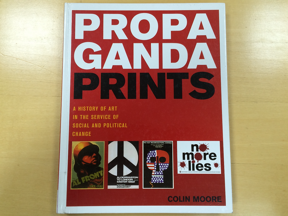
Ive also been looking at the book Propaganda Prints by Colin Moore. Of what stands out is when he says that propaganda "rely on repetition and to keep it simple, lies at the heart of every successful propaganda campaign."(P11). This is advice that can be put to good use when it comes to choosing the text and to make sure that it follows the same pattern. It has been mentioned to me before that if you want to make a point, then it needs to be repeated three times. This applies to all types of writing, wether it be academic style, or speech writing, etc, it is a basic principle that has been used for centuries.
So, as mentioned above, when I choose the text for the images, of what to text underline to draw attention to then I need to repeat the same sentiment each time. This means that I can keep choosing statements that describe an action, such as "we will eliminate" or "we will help" but to keep them as an open statement that can be finished by the photograph. So, for example, I can choose the words "we will secure" and then have a picture of an open door as this will contradict the statement.
Overall this will give the project a better focus and make it more relevant and understandable. Repetition is something that is a natural part of human behaviour, it's one way we assimilate knowledge and helps understand how things work. This can be put to good use and will also help with the cohesion and simplicity of the project.


Comments