Mixed Media Research
- Dave Macey

- Nov 15, 2015
- 4 min read
I’ve started looking at the Landscape Photographer of the Year competition in relation to using it as inspiration for the images for the manifesto proposal.
My initial impression is that they will fit with the idea that I have for the theme of the images. As a quick overview, all of the images I’ve viewed that have been either winners or highly commended and so represent the best of the entries. This in turn suggests that they exemplify what the competition organisers are looking for, what type of aesthetic they wish to see.
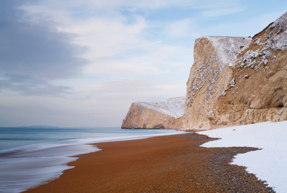
This image is the overall winner and was taken by Andy Farrer and is a photograph of Bats Head, Dorset. The image displays what is expected to be seen, a good composition, with a vanishing point created by the horizon, the snow, the sea and the pebbles all converging on one point and gives the illusion of depth. There are also other elements such as good exposure, good light, the use of the rule of thirds, etc that make this a good picture.
However, this must the cleanest beach I’ve ever seen! There is no detritus, no rubbish, no plastic bottles or tin cans that normally litter a beach. The sea looks soft and peaceful and the cliffs have a presence like monoliths that stretch back to the beginning of time. In other words, the image has been beautified to suggest an unrealistic and mythical view of the English landscape.
The winning entry does not stand alone in this romanticising of the english landscape. Julian Elliott’s
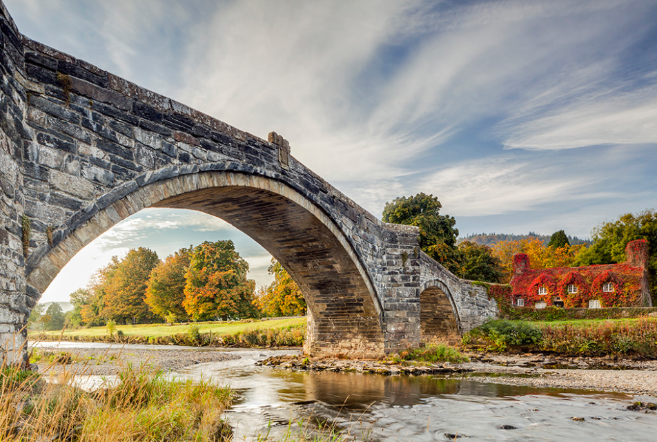
image of Pont Fawr & River Conwy, Llanrwst also demonstrates the same qualities. It is beautifully composed with all of the traditional elements included, the rule of thirds, golden light, good exposure, etc, but the image has been overcooked in photoshop and carries nothing more than a romantic view of a mythical Britain. It even goes as far as reminding me of The Shire from The Hobbit and I partly expect to see Frodo sitting under a tree reading a book…
There are many more examples on the website http://www.take-a-view.co.uk/2015-award-winners/ that demonstrate the same limited and unrealistic view of Britain. However though it does show of how popular this competition and images are, that it is a high profile national competition and so consequently carries a large amount of prestige for the winner and ultimately confirms the popularity of this delusion.
So it could then become a case that images which promote a beautiful landscape also promote a beautiful world and as these are all images of Britain, then Britain becomes a beautiful world we all live in. This is a world where nothing goes wrong, everything is in harmony, there is no conflict of interests. It promotes an idyllic and perfect world that is full of delusion and myth.
But, these type of images are popular and so people want to believe the lie they promote. I can imagine that the art world will steer clear of these images because of the overstated beauty but the general public will like these images because they promote a vision of what Britain should look like.
I’ve also been thinking more about how propaganda works. Propaganda will use images that either inspire or aspire or both. These images offer an aspiration of living in a perfect world and so would be fitting to use in a propaganda campaign. I can imagine if these images were used with text then the connotation of the image’s beauty could be used to support a vision of striving towards a perfect world.
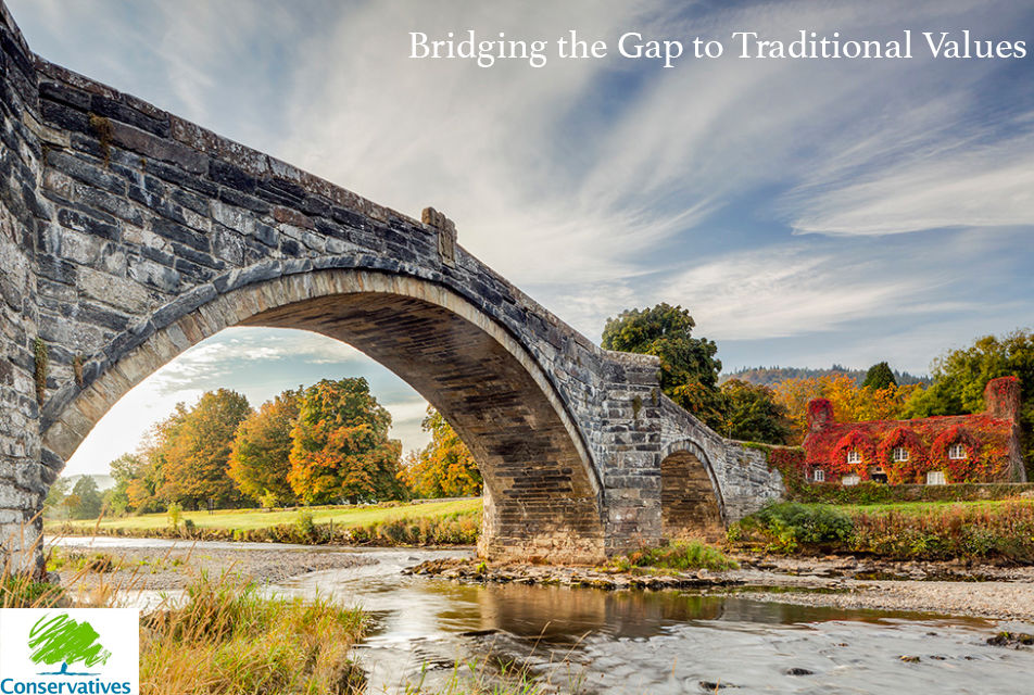
With this in mind, I’ve made a quick mock up and added some text and also the conservative logo. With these two elements it makes the meaning of the photograph promotes a sense of tradition and nostalgia and then links those qualities to the conservative party. I freely admit it’s not the best example, but it was constructed within 5 minutes and very little thought, but it serves just as an example.
So we now have an overly beautified image that is being linked to tradition, nostalgia and the conservative party. It is an image that easy to read and understands as there is a lacking of ambiguity. The text and symbol make the message even more explicit and avoids any other misunderstanding. Ultimately the image has become propaganda for the tory party.
I do now feel that I have a better understanding of propaganda and it can be summed up with the following:
It needs a political message.
Has to promote either an aspiration or an inspiration or both.
Needs to be delivered as widely as possible to the appropriate groups.
All three support each other and act as a tripod to support the propaganda. But there is another point that is not listed above and this is how the propaganda is received, how willing are the general public to believe the propaganda. This is all a question of timing and focusing the propaganda towards the right groups, for instance I can imagine that the above image would relate more to white middle class than to a black youth. Propaganda will only work if it reinforces an element that already exists within the viewer.


Comments